Wednesday 26 January 2011

Creating a brand


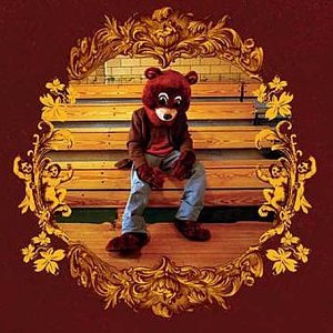
Although Kanye West, a male rap artist isn't in our genre- he knows how important it is to create a brand. His teddy bear logo has been featured on every single one of his albums to date, on merchandise and even on limited edition Bape trainers. This means that we can immediately associate the teddy bear with Kanye West- increasing his popularity and making his presence felt in all aspects of life. In our questionnaire from last week, we found out that our target audience believed that a cake should be our 'Kanye West teddy bear' and although this seemed a little odd- we took on the challenge and sought to find a cake to represent the KIRA KITSON brand!

Luckily it didn't take us long, and whilst popping to the shops before a Media lesson- we managed to pick up this beauty!


It was perfect! A traditional Belgian bun- it had something very retro about it, which is a common convention of both the female solo artist genre and indie music. White and red was a colour scheme that we would like to follow. Immediately we could see that with a little bit of editing, we could easily incorporate this bun into the ancillary tasks and music video to make a consistent link throughout the entire project. The cherry on top also led to us deciding that red was going to be Kira's colour, and her name would always be written in red font on album covers and the colour of her lipstick in the music video- red was also found to be the popular colour with our target audience. We've also decided that a very pristine, Stepford Wives feel for an album cover would really tie with the genre and appeal to our audience!

Just finding our logo, the Belgian bun- sparked off many other ideas in regards to giving Kira more of an identity, and now we have a lot more to work with within the creative process.

EDIT: Also, Katy Perry wears a set of them in her video for 'California Gurls'!
My analysis can be found here :)

Monday 24 January 2011

Friday 21 January 2011

Risk Assessment

What is a risk assessment?
When filming, especially in the music industry- risk assessments are very important to ensure that if an accident occurs- you would have previous assessed the risk and tried to your best to prevent it, making claiming insurance easier! However, this does not apply so much for an A-level Media Studies music video- but we have tried our best to scale down the process to get a feel for what real music producers have to do when producing a music video.

Risk assessment is the process where you:

Identify hazards.
Analyze or evaluate the risk associated with that hazard.
Determine appropriate ways to eliminate or control the hazard.
In practical terms, a risk assessment is a thorough look at your workplace to identify those things, situations, processes, etc that may cause harm, particularly to people. After identification is made, you evaluate how likely and severe the risk is, and then decide what measures should be in place to effectively prevent or control the harm from happening.

Why is risk assessment important?
Risk assessments are very important as they form an integral part of a good occupational health and safety management plan. They help to:

Create awareness of hazards and risks.
Identify who may be at risk (employees, cleaners, visitors, contractors, the public, etc).
Determine if existing control measures are adequate or if more should be done.
Prevent injuries or illnesses when done at the design or planning stage.
Prioritize hazards and control measures.

What is the goal of risk assessment?
The aim of the risk assessment process is to remove a hazard or reduce the level of its risk by adding precautions or control measures, as necessary. By doing so, you have created a safer and healthier workplace.


Risk Assessment

Wednesday 19 January 2011

Mis-en-Scene Questionnaire!

How was everyone's Christmas?! Now the festive season is over, Parisienne Records is back with a survey into mis-en-scene. Being in a college made up of 16-19 year olds, and approximately 50% of us girls- we are very lucky to be surrounded with our target audience. I created this short survey to try and get a feel for what our target audience likes to see in a music video in regards to colour and even other celebrity influences and compiled them into a graph on Microsoft Excel to see what appeals to them in a more easy to read format.


I asked...What colour would you like to see used in mostly in a Kate Nash music video?


As we probably guessed, from asking teenage girls- colours like pink and red came out on top with no one choosing beige as the idea colour. From this, we can tell that our target audience would be attracted by brighter, feminine colours and we need to take this into consideration when creating our ancillary pieces and the final production.

I asked...What type of scenario would you prefer in a Kate Nash music video?


From the look of the results, it's apparent that serious subject matter à la Christina Aguilera but something silly and little bit more light-hearted that will make people laugh! We are pleased with this result as we hurried into making a humorous narrative, and it is one thing less to worry about as we know this will please our audience.

I asked...What artists should we look to for inspiration who you admire the most?

Katy Perry came out on top for this one, and we were again very pleased by this as we had already done a lot of research into her album covers and music videos- this shows that both me and Dora know our target audience very well (perhaps this is to do with us being members of our own target audience?!). This makes it clear that we need to delve further into what makes Katy Perry so appealing by researching a few more of her music videos and looking at her own personal conventions- as this is clearly a sure fire way to appeal to our target audience. Ellie Goulding came second, and this was expected as she is, like Kate Nash- more indie/pop so we need to see how she balances the two genres and perhaps try to emulate that in our own project.

I asked...What do you think should be the 'symbol' of the artist 'Kira Kitson'?


We thought this was a slightly odd result as we thought perhaps sweets or stars would be the most popular with our target audience, but they seemed to be quite adamant that cakes would be the best logo when it came to creating a KIRA KITSON brand. Obviously, we want to appeal to them and make something that they will like- so we will endeavor to try and use a cake as our logo!


Tuesday 4 January 2011

Ancillary Task research: Digipaks

Jessie J- Who You Are (2011)
Jessie's album cover for 'Who You Are' uses a close up as the main image. This shot is almost aggressive- but it intrigues the consumer instead of scaring them off. Jessie is portrayed to be a modern image of a female solo artist- instead of appearing as a feminine sex object, she is feisty and cool, which is reflected in the monochrome colour scheme. The only exception is 'Jessie J' written in gold, which gives the female solo artist cover a hip hop edge which toughens up Jessie's image even more but the gold colour represents her as 'expensive'. This is a very unique CD cover and to be honest- I haven't seen anything else like it on the high street, it would certainly get my attention on the shelfs of HMV so I will try and bring an element of individuality to my own ancillary task.

Ellie Goulding- Bright Lights (2010)
Ellie Goulding's digipack for Bright Lights has a fantasy element that comes with her music, and this expresses a branding concept throughout her work. The majority of her videos feature a bokeh effect, and the video for her single Lights uses the exact same effect. This shows me that it is important to keep a degree on continuity with each piece and make sure that everything fits in perfectly. Again, like Jessie J's album- a close up is used which shows that a close up is the convention of a CD cover for a female solo artist. The colours used aren't overly feminine- but this fits Goulding's style of music- which is dreamlike indie pop, so the golds, creams and sea blues tie in with this.

Katy Perry- One of the Boys (2008)
Out of the three digipak covers that I have looked at, Katy Perry's album cover for One of the Boys is the most sexually charged. She is showing her full body- a contrast to the other female solo artists and is using traditional feminine colours of bright pink and aqua. However- I think that it is my favourite album cover of the three because the retro styling of the album is just what we have been researching, and the kitsch colours and props are very quirky- just like Kate Nash, the artist who we are creating a music video for. I believe that the long shot used in this album cover is really effect as it gives the consumer a chance to see Katy in her surroundings- which turns the cover into a piece of art. I will definitely consider the use of props in my ancillary task because I love the effect that it gives.