Showing posts with label Representation. Show all posts

Wednesday, 26 January 2011

Creating a brand


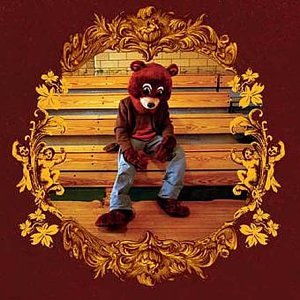
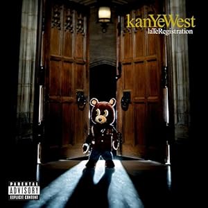
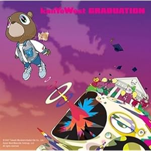
Although Kanye West, a male rap artist isn't in our genre- he knows how important it is to create a brand. His teddy bear logo has been featured on every single one of his albums to date, on merchandise and even on limited edition Bape trainers. This means that we can immediately associate the teddy bear with Kanye West- increasing his popularity and making his presence felt in all aspects of life. In our questionnaire from last week, we found out that our target audience believed that a cake should be our 'Kanye West teddy bear' and although this seemed a little odd- we took on the challenge and sought to find a cake to represent the KIRA KITSON brand!

Luckily it didn't take us long, and whilst popping to the shops before a Media lesson- we managed to pick up this beauty!


It was perfect! A traditional Belgian bun- it had something very retro about it, which is a common convention of both the female solo artist genre and indie music. White and red was a colour scheme that we would like to follow. Immediately we could see that with a little bit of editing, we could easily incorporate this bun into the ancillary tasks and music video to make a consistent link throughout the entire project. The cherry on top also led to us deciding that red was going to be Kira's colour, and her name would always be written in red font on album covers and the colour of her lipstick in the music video- red was also found to be the popular colour with our target audience. We've also decided that a very pristine, Stepford Wives feel for an album cover would really tie with the genre and appeal to our audience!

Just finding our logo, the Belgian bun- sparked off many other ideas in regards to giving Kira more of an identity, and now we have a lot more to work with within the creative process.

EDIT: Also, Katy Perry wears a set of them in her video for 'California Gurls'!
My analysis can be found here :)

Tuesday, 4 January 2011

Ancillary Task research: Digipaks

Jessie J- Who You Are (2011)
Jessie's album cover for 'Who You Are' uses a close up as the main image. This shot is almost aggressive- but it intrigues the consumer instead of scaring them off. Jessie is portrayed to be a modern image of a female solo artist- instead of appearing as a feminine sex object, she is feisty and cool, which is reflected in the monochrome colour scheme. The only exception is 'Jessie J' written in gold, which gives the female solo artist cover a hip hop edge which toughens up Jessie's image even more but the gold colour represents her as 'expensive'. This is a very unique CD cover and to be honest- I haven't seen anything else like it on the high street, it would certainly get my attention on the shelfs of HMV so I will try and bring an element of individuality to my own ancillary task.

Ellie Goulding- Bright Lights (2010)
Ellie Goulding's digipack for Bright Lights has a fantasy element that comes with her music, and this expresses a branding concept throughout her work. The majority of her videos feature a bokeh effect, and the video for her single Lights uses the exact same effect. This shows me that it is important to keep a degree on continuity with each piece and make sure that everything fits in perfectly. Again, like Jessie J's album- a close up is used which shows that a close up is the convention of a CD cover for a female solo artist. The colours used aren't overly feminine- but this fits Goulding's style of music- which is dreamlike indie pop, so the golds, creams and sea blues tie in with this.

Katy Perry- One of the Boys (2008)
Out of the three digipak covers that I have looked at, Katy Perry's album cover for One of the Boys is the most sexually charged. She is showing her full body- a contrast to the other female solo artists and is using traditional feminine colours of bright pink and aqua. However- I think that it is my favourite album cover of the three because the retro styling of the album is just what we have been researching, and the kitsch colours and props are very quirky- just like Kate Nash, the artist who we are creating a music video for. I believe that the long shot used in this album cover is really effect as it gives the consumer a chance to see Katy in her surroundings- which turns the cover into a piece of art. I will definitely consider the use of props in my ancillary task because I love the effect that it gives.

Friday, 15 October 2010

Representation within our music video

What different groups of people do you have in your genre?
Within our music video, we are using a variety of stereotypes to add a touch of light humour to our music video. The majority of the stereotypical representation comes in the form of the 3 men who are infatuated with the protaganist, to show the diversity between her partners and that she'd happily go out with anyone. We have 'The Geek', 'The Hunk' and 'The Bohemian' all chasing after a realitively new stereotype of women which we have referred to as 'Indie Girl'. In recent years, singers like Adele, Amy Winehouse, Kate Nash and Florence + The Machine have rose to success without ever portraying themselves as sex objects- they are still attractive and dress femininely, but play instruments as opposed to dancing scantily clad and portray a sassy and feisty attitude.

What are the common stereotypes?
'The Hunk':
Cocky, muscley, stylishly dressed but slightly dim-witted. He is going to be featured in a gym scene where the protaganist is spotting him as he lifts weights.

'The Geek':
Shy, nervous, cute, bow tie + glasses. He is going to be having a romantic picnic with the protaganist, and perhaps on a country bike ride. She gets bored by him in the end and cycles of to meet up with another guy.

'The Bohemian':
Alternatively dressed, an artist, sensitive. He will be painting a picture of the protaganist whilst she poses.

'Indie Girl':
Kooky dress sense, big hair, sassy, witty, fun.

Are they traditional or modern representations?
'The Geek', 'The Bohemian' and 'Indie Girl' are all modern representations as they go against the traditional grain that states that men are big and strong, and women are meek sex objects.

What changes have there been in society which have impacted on the representations of your groups?
As I stated earlier, the popularity of female indie-pop artists have influenced a generation of girls who can be seen shopping at Urban Outfitters with big backcombed hair. Rising numbers of people going to university have caused the 'The Geek' to be even more apparent in young society, with characters like Will from The Inbetweeners or the entire male cast of The Big Bang Theory. Metrosexual fashion has influenced more males to embrace their feminine side, with celebrities like Russell Brand popularizing a bohemian look. LAD culture of binge drinking, clubbing and fashionable clothes has also had a huge impact on 'The Hunk' within our music video.

Sunday, 10 October 2010

Ellie Goulding- 'Your Song': analysing existing media texts


In the video for Ellie Goulding's song, 'Your Song'- it's simplicity is what makes it beautiful. I've tried my best to analyse very different music videos, and this is unlike anything that I've ever seen before. It has a muted colour palette of soft beiges and greens from the trees, and a bokeh effect has been used on the footage to give it a dreamlike feel.

There is no set narrative to the music video, it features Ellie in situations with her friends and family (walks in the park, playing on a piano, on a train) but the bokeh effect, but this is interjected with a scene of her in the woods on her own- much sharper in effect than any other scene in the music video. This suggests that she is reminiscing of a time in the past.

'Your Song' is very ballad-like and slow in comparison to the other songs I have analysed, 'California Gurls' and 'Foundations' and therefore the conventions most likely wouldn't apply to our video for 'Pumpkin Soup' but something we could take from the video is the use of close ups- as they were especially effective at drawing us into Ellie's story, and the indie styling in terms of clothes and hair- as we can't forget about about the indie half of Kate Nash's music.

Katy Perry- 'California Gurls': analysing existing media texts


Katy Perry's video for California Gurls is set in a fantasy land called Candyfornia, where Katy and a gaggle of confectionery themed girls are players in a board game owned by the Candy King- Snoop Dog. It has a very vibrant and sugar sweet colour palette which is presented to the audience in the Willy Wonka style setting and Katy's costumes; throughout the video she is wearing a confectionery-encrusted dress with a lilac wig, wrapped in a candy floss cloud, a girl scout outfit and a pair of sparkly blue hot pants and a cake bra! This shows that Mis-en-Scene is really important in terms of costume, this is probably down to the target audience of Katy Perry being young girls- so looking good (even if it is a little crazy!) is very important, we need to remember this when making our own music video as we share the same audience as Katy!

The narrative involves Katy battling through the board game, adding to her team of candy girls and eventually taking on Snoop Dog- however, like many other music videos- it incorporates a scene, usually a studio, which will interject between the narrative where the artist is solely lip syncing singing. We will most likely follow this pattern too as it keeps the piece true to the form of the music video.

At the end of the video, Katy goes back to basics and fits the conventions of a traditional female solo artist- with a racy dance routine with a legion of back up dancers! I don't think this would be horrible appropriate for a Kate Nash music video, but it kind of told us that even though Kate Nash's music is a little bit more 'feminist' (for lack of a better word), sex appeal may be very important when creating a music video so it can appeal to both sexes.

Kate Nash 'Foundations' - analysing existing media texts


This is something we need to look into a lot of detail- a video by Kate Nash herself! The colour scheme is quite unique- being quite muted, lots of beiges and pale blues- but with splashes of yellow such as Kate's dress, a Power Ranger toy, lemons and bottles of lager in the fridge. As the long is about a couple on the process of breaking up- to me the splashes of yellow represent hope and happiness amongst the storm. I like the idea of doing a similar thing with 'Pumpkin Soup'.

Also, a lot of stop motion is used- the couples' socks trying to get tangled up with each other and their toothbrushes trying to 'kiss'- this gives a fun childlike element to the video. In terms of camera shots, mostly close ups are used as Kate is telling us her most intimate thoughts- and these make us feel close to her.

Unlike other female solo artists, Kate more or less sings/lip syncs throughout her whole music- as her songs are like stories that just need to be told rather than just music. I think we will probably employ this within our music video to try and fit her usual conventions.