
A2 Research and Practical Production
Monday, 2 May 2011
Evaluation: Media Technologies
"How did you use new media technologies in the construction, research, planning and evaluation stages of your project?"


A range of programs and websites that we used to create our media texts
(Facebook, Scribd, YouTube, Photoshop CS5, Cyberlink YouCam, Blogger & Adobe Premiere Pro)
New media technologies had a huge effect for us in terms of editing, For our AS year, despite working in separate groups- both me and Dora used iMovie and we both found it more suited to edit videos of family ski holidays rather that A-level Media Studies coursework. Therefore we made the decision to swap to Adobe Premiere Pro, a program that I used at GCSE- this would have allowed us to edit the film accurately, cutting clips by each millisecond as well as providing a wealth of features to touch up the lighting and vibrancy of our footage. To create visually impressive artwork for our ancillary tasks- we both needed to learn to use Adobe Photoshop CS5-this proved very tricky and we were very slow getting started on our ancillary tasks as a result of this! However, once we had dedicated a few lessons to improving our skills- we came on really quickly and edited some beautiful photos to use in our ancillary task. Also, shooting our photos in RAW format allowed any colour corrections to be made with ease and gave us a very high quality photograph overall.
Before Photoshop CS5:

After Photoshop CS5: 
The Internet also had a huge effect on our media products. Here we could promote Parisienne Records, find out for information about our target audience, display our video and house all of our research in a very efficient and professional blog. We used Blogger, a (would you believe it...) blogging site to create a media hub where we could display all of our research, drafts, pictures, filming logs in one place that was accessible to everyone and very easily edited. This was very useful when it came to presenting questionnaire results as graphs. All of these aspects of blogging were very useful and a complete godsend to two Drama students like Dora and I who have spent approximately half of our lives faffing around with ring binders and plastic wallets to display our coursework. As a result, we were more organised and efficient workers with a clear concept of time management, as everything was laid out in front of us and easy to reach. Also, Dore and I also ventured into vlogging territory through the use of recording programs like Cyberlink YouCam (here is an example vlog). This modern way of documenting progress gave our blog a multimedia feel and was also much more fun to do than type out paragraphs of text!
As we were surrounded by our target audience, we didn't use the Internet so much for interacting with our target audience as we found a 'DIY' approach of going up and talking to people more effective. However, the Internet was was very important in finding out more about our target audience. For example, we could use 'facebook stalking' to great effect by checking out the profiles of people who had 'liked' Kate Nash's facebook page and see what other types of music they were into we could also do a similar thing with the 'suggestions' bar on YouTube where we were given a list of similar videos from similar artists- this allowed us to also get a better understanding of the female solo artist genre so we could find out the conventions, and follow and challenge them where we saw fit.
Evaluation: Audience feedback

"What have you learnt from your audience feedback?"
From creating this media text, this project has taught me the importance of knowing you target audience. Without knowing your target audience and what they like and dislike, it is somewhat impossible to create a successful media product.
Me and Dora were very lucky in the sense that we were members of Kate Nash's target audience, females aged between 16-24 so we already had a good idea to what would and wouldn't work in our music video and ancillary texts. Also, we were fortunate enough to be in a sixth form where half of the population were members of our target audience- so we were able to get an unbiased opinion on options like mis-en-scene, specific costumes, camera movement and sound from a wide variety of people.
Me and Dora were very lucky in the sense that we were members of Kate Nash's target audience, females aged between 16-24 so we already had a good idea to what would and wouldn't work in our music video and ancillary texts. Also, we were fortunate enough to be in a sixth form where half of the population were members of our target audience- so we were able to get an unbiased opinion on options like mis-en-scene, specific costumes, camera movement and sound from a wide variety of people.

Although the other groups in our class found Web 2.0 especially useful for grasping opinions for their target audience, via the mediums of Facebook and Twitter- despite all of our efforts...our social networking pages remained horribly bare except for sweet, yet unhelpful comments such as 'love your hair extensions!' or 'nice video babe!' as a result- me and Dora found it much more effective to take it out to the people with questionaires and Q&A sessions with our target audiences (click here for the questionaire results & click here for a Q&A with a member of our target audience) as this allowed us to achieve direct comments and results that would help us understand how to go about creating a good music video and set of side projects, as well as evaluating whether or not we had been successful in doing so.
In the production stages, the questionaire that we took around sixth form was vital to the mis-en-scene of our video, which is arguably the most important aspect, as music television is 100% visual and we would need to use mis-en-scene the most to both challenge and follow coventions. However, in hindsight- we should have started this process much earlier than we did. From the start we had an idea of making the video very cute and kitsch, with quirky mis-en-scene and a humourous storyline...so we seemed to base all of our research and storyboarding on those aspects. Parisienne Records was very lucky that our target audience believed that was the correct way to go about making this music video. If the results of our questionaire showed that our audience wanted a black and white, understated, serious video- then we would have been in a lot of troubleas our research just wasn't broad enough. If I was to make this project again I would have made target audience feedback and input a huge priority right from the start.
In post production- we learned a lot from our feedback, mostly that we had been successful in creating a fun music video that appealed to our target audience. Despite not relying on Web 2.0 and social networking websites, the 'kind, but unhelpful comments' that I mentioned earlier are still proof that people liked what they saw when they watched our music video on DailyMotion- when we both shared it on our private Facebook accounts- it garnered a lot of likes and positive comments...mostly from people of our target audience. In class screenings, people responded well. However, when it came to a more specific Q&A with a member of our target audience we saw that the gender role reversal was only 'slight' and that we could have afforded to take the storyline a bit further in regards to the girl being a 'player' and to maybe add some shots of the protaganist chatting to her friends about her 'dilemma' but that was their only qualms with it. We were complimented on it being fun, quirky and very fitting of the genre- which was exactly what we were going for. Our ancillary tasks were also deemed very professional and that they drew a lot of paralells with other famous female solo artists like Rihanna and Katy Perry- which shows that our research was not wasted.
If I was to make this project again, I think I would have utilised the Q&A function very early on, as this direct and specific advice coming straight from the mouths of the target audience would have been very effective in making a strong media text. Even though we have recieved positives reviews from our peers, teachers and target audience, there is always room for improvement.
Evaluation: The effectiveness of our main product and ancillary texts
"How effective is the combination of your main product and the ancillary texts?"
As a group, we have endeavoured to make our main product (music video) and ancillary tasks (campaign poster and digipack) as professional as possible by examining what real solo artists do, and attempting to emulate them in our media texts. Firstly, we looked at the themes shared between the all three products. We noticed that they all had the same 'feel' to them in terms of colours and mood of the footage, but the themes of the music video and the ancillary tasks should be very much separate- the video is based around the song and the song is part of the album which is it's own theme in itself. However, to ensure that we had a certain degree of continuity, one of the outfits that was used in the music video was also used for the album cover and inserts, we also made sure that we captured the cheeky, playful mood of the music video by using a sugar pink and scarlet colour pallet. Also, the video as quite a 'narcissistic' feel to it, as it is full of close-ups and tends to feature the protaganist more than any other character, so we tried to use the same kind of shot for our album cover and insert, which is also a convention of the "How effective is the combination of your main product and the ancillary texts?"female solo artist genre.

We have done this very effectively and all audience feedback that we have recieved has commented on how well the three media products seem to link together, without being overly matching.


Saturday, 2 April 2011
Q&A with Alice, a member of our target audience.
 Alice is 17 years old. She is a student and a part-time barista at Starbucks.
Deanna:
So, Alice- firstly I'd like to take the time to thank you for agreeing to take part in this Q&A session with Parisienne Records!
Alice:
That Is Okay, I'm More Than Happy To Participate!
Deanna:
Firstly, what did you think of the video in general?
Alice:
It Seems Quite Fun, Light Hearted, Which Matches The Song Really Well.
Deanna:
Do you think that the light-hearted mode of address would appeal to the target audience of females aged 16-24?
Alice:
Definitely, It's Funny, It's Quirky, And Tailored To Someone Who Just Wants A Little Fun.
Deanna:
Would you say that Parisienne Records have followed the conventions of a female solo artist?
Alice:
I Believe So, The Song Is A Catchy Poppy Tune That Most Can Bop Along To With An Amusing Video To Match
I Believe So, The Song Is A Catchy Poppy Tune That Most Can Bop Along To With An Amusing Video To Match
Deanna:
Have they broken any stereotypes associated with the genre? Something that other people have commented on is that the storyline involves the girl being the 'player' whereas a lot of songs focus on a girl being dumped, or being too shy to show her feelings...
What do you think of this opinion?
Alice:
Most Female Solo Artists Often Sing About 'Sisters Doing It For Themselves', Which I Believe Is Shown Throughout. There Is A Slight Role Reversal, Yes, But Not Necessarily A Large One.
Deanna:
Do you think that this would have made females aged 16-24 more likely to watch it?
Alice:
Quite Possibly, That Target Audience Would Certainly Enjoy It More Than Others.
Deanna:
Is there anything else that could have been done to make it appeal to our target audience even more?
Alice:
If I Was To Add Anything, It Would A Couple Of Shots Of The Female Discussing Her 'Dilemma' With Her Friends.
Deanna:
Ok. So what did you think of the ancillary tasks? (The poster and digipack)
Alice:
Alice:
I Thought They Were Excellent, Very Up To Date And Fitting With Similar Artists Today, Like Katy Perry and Rihanna. I liked the use of the colour red with the fonts because it symbolised passion and confidence, which is what I would associate with the video.
Deanna:
Deanna:
Did you notice the branding? Can you guess what it was?
Alice:I think it was the belgian bun- it was used quite heavily in the ancillary tasks and I thought this was very effective as it gave it a retro feel.
Deanna:
Correct! Okay Alice, thank you so much for your time!
Alice:
Glad I Could Help!
Alice:I think it was the belgian bun- it was used quite heavily in the ancillary tasks and I thought this was very effective as it gave it a retro feel.
Deanna:
Correct! Okay Alice, thank you so much for your time!
Alice:
Glad I Could Help!
Thursday, 3 March 2011
Friday, 18 February 2011
Location Shoots
As I learned from working with the University of Bristol students, it is really important to plan exactly where you are going to be filming so you can ensure perfect continuity when you are actually in the production stage.
location shoots
location shoots
Ancillary Test Shots

A2 Media Studies.: Test Anciliary Shots.
Here is a link to a blog post by my partner Dora Lynn, it displays our ancillary test shots that we took to get a feel for the album cover and poster and to give us inspiration for the main ancillary tasks- we thought they were very conventional of Kate Nash.
Thursday, 17 February 2011
A2 Media Studies.: Target Audience Case Study - Sidonie
A2 Media Studies.: Target Audience Case Study - Sidonie:
Here is a link to my partner, Dora Lynn's blog where she closely examined a member of her target audience for research purposes.
Here is a link to my partner, Dora Lynn's blog where she closely examined a member of her target audience for research purposes.
Saturday, 5 February 2011
Ancillary Drafts
Here are the drafts of our ancillary tasks- we took the photos at the 'Studio' shoot yesterday where we decided that we would select the options of a digipak for a CD and a poster. Dora's main role within the group is to be in control of editing and cinematography- and mine is to create the ancillary tasks, act in the video and try and lead the group in terms of research, therefore it was up to me to draft the ancillary tasks.


Again, I tried to keep to the same theme when creating the front cover of the digipack- I haven't done the inside of the booklet yet as I merely wanted to get a feel about what I'm going to do as I'm going to start doing the final drafts of the ancillary tasks in a few days. I used a photo from the same photoshoot as the video and poster so this 'look' can be associated with Kira Kitson's era of music- creating a brand. In the poster I used a google image picture of a belgian bun and cut it out on Photoshop, however for the digipak I used a real belgian bun to make it look it more aethentic and pleasing. I also think it will be best to repeat this design and use a close up because it played to the typical conventions of the female solo artist- we looked at this genre here---> LINK. I felt that this was quite important as consumers like repetition, so this more traditional CD cover would be more appealing the consumer on the shelf of HMV. I followed suit in terms of the poster by using increasing the saturation to make the red brighter.
I think I have made a very good start- and the final ancillary task will be up soon.
Friday, 4 February 2011
ONE: 'Studio' scenes & Ancillary Shoot
Me and Dora booked out the school's photography studio in order to create a really professional effect for both our music video and the ancillary tasks. To ensure that we had a sense of continuity, a link, if you will- between the ancillary tasks and the music video- we decided to do capture both on the same day, using the same props and styling.
In order to achieve a perfect sync when editing the footage- I had to sing aloud to an MP3 of Kate Nash's 'Pumpkin Soup'! I felt really stupid as the photography studio is in a classroom, which was full of people- but I tried to treat it like a drama performance and after that I realised that people were more so watching me than laughing at me, and this gave me the confidence to perform more. Singers like Kate Nash are really gutsy performers who show a lot of emotion with their faces and bodies so I tried to give a very energetic performance that would be entertaining to watch as part of a music video.
When we had finished filming that section (and I was very tired from by the ends of it!) we moved onto taking pictures for our digipak and poster. This time we brought in props of cakes and biscuits to make it a little bit more interesting- especially the Belgian bun that we decided would be KIRA KITSON's logo. I really enjoyed that part of the shoot as I spent an hour posing and eating cakes- and the fact that I was enjoying what I was doing came across really well in the photos. We were so pleased with them, and the footage itself- just from playing it back on the camera...it's clear that the filming we have done this afternoon has very much fitted the conventions but also seems very unique.
Filming Log
As a group, we have left our filming quite late and mainly focused on research. Our reasons for this is because didn't want to do our filming in dregs, as we'd experience continuity errors and a lack of creativity as we started too early!
As a result, I drew up this 9 week filming plan, that should end about 2 weeks before final hand in. We will be shooting the studio scenes as soon as this blog entry is published so we're determined to stick to it. Unfortunately, there is a school holiday that sets us back a week- but this is a perfect opportunity to catch up on filming logs and any extra research.

As a result, I drew up this 9 week filming plan, that should end about 2 weeks before final hand in. We will be shooting the studio scenes as soon as this blog entry is published so we're determined to stick to it. Unfortunately, there is a school holiday that sets us back a week- but this is a perfect opportunity to catch up on filming logs and any extra research.

Click to enlarge :)
*Studio = The 'Studio' scenes, where Kira is on her own on a white backdrop, singing to the camera. We will also use this as an opportunity to take pictures for the ancillary tasks.
*Research= This is time we will use to dedicate to our blogs.
*Geek= The scenes were Kira is being wooed by a bespectacled genius.
*Hunk= _____________________________ hunky gym fanatic.
*Bohemian- _________________________ an artistic gent who is the one taking pictures of her in the studio.
*Rough cut= In this week we will assemble the main rough cut of footage.
*Final tweaks= If a scene isn't working, this week is dedicated to sorting it out.
*Final edit= Editing the final piece.
*Evaluation= Time to tie up any loose ends and work on our evaluations.
Wednesday, 2 February 2011
Plans for the digipack
This is a brief plan for the positioning of texts and images on my cd cover/digipack. I thought this was quite important to plan because good planning will ensure that my digipack will be the best that it can be
plansss
plansss
Wednesday, 26 January 2011
Creating a brand
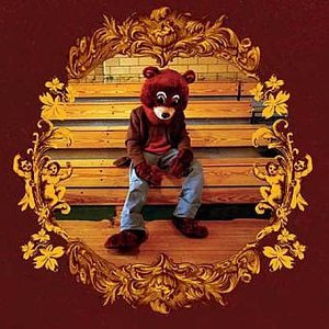
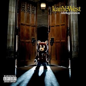
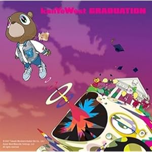
Although Kanye West, a male rap artist isn't in our genre- he knows how important it is to create a brand. His teddy bear logo has been featured on every single one of his albums to date, on merchandise and even on limited edition Bape trainers. This means that we can immediately associate the teddy bear with Kanye West- increasing his popularity and making his presence felt in all aspects of life. In our questionnaire from last week, we found out that our target audience believed that a cake should be our 'Kanye West teddy bear' and although this seemed a little odd- we took on the challenge and sought to find a cake to represent the KIRA KITSON brand!
Luckily it didn't take us long, and whilst popping to the shops before a Media lesson- we managed to pick up this beauty!

It was perfect! A traditional Belgian bun- it had something very retro about it, which is a common convention of both the female solo artist genre and indie music. White and red was a colour scheme that we would like to follow. Immediately we could see that with a little bit of editing, we could easily incorporate this bun into the ancillary tasks and music video to make a consistent link throughout the entire project. The cherry on top also led to us deciding that red was going to be Kira's colour, and her name would always be written in red font on album covers and the colour of her lipstick in the music video- red was also found to be the popular colour with our target audience. We've also decided that a very pristine, Stepford Wives feel for an album cover would really tie with the genre and appeal to our audience!
Just finding our logo, the Belgian bun- sparked off many other ideas in regards to giving Kira more of an identity, and now we have a lot more to work with within the creative process.
EDIT: Also, Katy Perry wears a set of them in her video for 'California Gurls'!
My analysis can be found here :)
Monday, 24 January 2011
Friday, 21 January 2011
Risk Assessment
What is a risk assessment?
When filming, especially in the music industry- risk assessments are very important to ensure that if an accident occurs- you would have previous assessed the risk and tried to your best to prevent it, making claiming insurance easier! However, this does not apply so much for an A-level Media Studies music video- but we have tried our best to scale down the process to get a feel for what real music producers have to do when producing a music video.
Risk assessment is the process where you:
Identify hazards.
Analyze or evaluate the risk associated with that hazard.
Determine appropriate ways to eliminate or control the hazard.
In practical terms, a risk assessment is a thorough look at your workplace to identify those things, situations, processes, etc that may cause harm, particularly to people. After identification is made, you evaluate how likely and severe the risk is, and then decide what measures should be in place to effectively prevent or control the harm from happening.
Why is risk assessment important?
Risk assessments are very important as they form an integral part of a good occupational health and safety management plan. They help to:
Create awareness of hazards and risks.
Identify who may be at risk (employees, cleaners, visitors, contractors, the public, etc).
Determine if existing control measures are adequate or if more should be done.
Prevent injuries or illnesses when done at the design or planning stage.
Prioritize hazards and control measures.
What is the goal of risk assessment?
The aim of the risk assessment process is to remove a hazard or reduce the level of its risk by adding precautions or control measures, as necessary. By doing so, you have created a safer and healthier workplace.
Risk Assessment
Wednesday, 19 January 2011
Mis-en-Scene Questionnaire!
How was everyone's Christmas?! Now the festive season is over, Parisienne Records is back with a survey into mis-en-scene. Being in a college made up of 16-19 year olds, and approximately 50% of us girls- we are very lucky to be surrounded with our target audience. I created this short survey to try and get a feel for what our target audience likes to see in a music video in regards to colour and even other celebrity influences and compiled them into a graph on Microsoft Excel to see what appeals to them in a more easy to read format.

As we probably guessed, from asking teenage girls- colours like pink and red came out on top with no one choosing beige as the idea colour. From this, we can tell that our target audience would be attracted by brighter, feminine colours and we need to take this into consideration when creating our ancillary pieces and the final production.

From the look of the results, it's apparent that serious subject matter à la Christina Aguilera but something silly and little bit more light-hearted that will make people laugh! We are pleased with this result as we hurried into making a humorous narrative, and it is one thing less to worry about as we know this will please our audience.
 Katy Perry came out on top for this one, and we were again very pleased by this as we had already done a lot of research into her album covers and music videos- this shows that both me and Dora know our target audience very well (perhaps this is to do with us being members of our own target audience?!). This makes it clear that we need to delve further into what makes Katy Perry so appealing by researching a few more of her music videos and looking at her own personal conventions- as this is clearly a sure fire way to appeal to our target audience. Ellie Goulding came second, and this was expected as she is, like Kate Nash- more indie/pop so we need to see how she balances the two genres and perhaps try to emulate that in our own project.
 We thought this was a slightly odd result as we thought perhaps sweets or stars would be the most popular with our target audience, but they seemed to be quite adamant that cakes would be the best logo when it came to creating a KIRA KITSON brand. Obviously, we want to appeal to them and make something that they will like- so we will endeavor to try and use a cake as our logo!
I asked...What colour would you like to see used in mostly in a Kate Nash music video?

As we probably guessed, from asking teenage girls- colours like pink and red came out on top with no one choosing beige as the idea colour. From this, we can tell that our target audience would be attracted by brighter, feminine colours and we need to take this into consideration when creating our ancillary pieces and the final production.
I asked...What type of scenario would you prefer in a Kate Nash music video?

From the look of the results, it's apparent that serious subject matter à la Christina Aguilera but something silly and little bit more light-hearted that will make people laugh! We are pleased with this result as we hurried into making a humorous narrative, and it is one thing less to worry about as we know this will please our audience.
I asked...What artists should we look to for inspiration who you admire the most?
 Katy Perry came out on top for this one, and we were again very pleased by this as we had already done a lot of research into her album covers and music videos- this shows that both me and Dora know our target audience very well (perhaps this is to do with us being members of our own target audience?!). This makes it clear that we need to delve further into what makes Katy Perry so appealing by researching a few more of her music videos and looking at her own personal conventions- as this is clearly a sure fire way to appeal to our target audience. Ellie Goulding came second, and this was expected as she is, like Kate Nash- more indie/pop so we need to see how she balances the two genres and perhaps try to emulate that in our own project.
I asked...What do you think should be the 'symbol' of the artist 'Kira Kitson'?
 We thought this was a slightly odd result as we thought perhaps sweets or stars would be the most popular with our target audience, but they seemed to be quite adamant that cakes would be the best logo when it came to creating a KIRA KITSON brand. Obviously, we want to appeal to them and make something that they will like- so we will endeavor to try and use a cake as our logo!
Tuesday, 4 January 2011
Ancillary Task research: Digipaks

Jessie J- Who You Are (2011)
Jessie's album cover for 'Who You Are' uses a close up as the main image. This shot is almost aggressive- but it intrigues the consumer instead of scaring them off. Jessie is portrayed to be a modern image of a female solo artist- instead of appearing as a feminine sex object, she is feisty and cool, which is reflected in the monochrome colour scheme. The only exception is 'Jessie J' written in gold, which gives the female solo artist cover a hip hop edge which toughens up Jessie's image even more but the gold colour represents her as 'expensive'. This is a very unique CD cover and to be honest- I haven't seen anything else like it on the high street, it would certainly get my attention on the shelfs of HMV so I will try and bring an element of individuality to my own ancillary task.

Ellie Goulding- Bright Lights (2010)
Ellie Goulding's digipack for Bright Lights has a fantasy element that comes with her music, and this expresses a branding concept throughout her work. The majority of her videos feature a bokeh effect, and the video for her single Lights uses the exact same effect. This shows me that it is important to keep a degree on continuity with each piece and make sure that everything fits in perfectly. Again, like Jessie J's album- a close up is used which shows that a close up is the convention of a CD cover for a female solo artist. The colours used aren't overly feminine- but this fits Goulding's style of music- which is dreamlike indie pop, so the golds, creams and sea blues tie in with this.

Katy Perry- One of the Boys (2008)
Out of the three digipak covers that I have looked at, Katy Perry's album cover for One of the Boys is the most sexually charged. She is showing her full body- a contrast to the other female solo artists and is using traditional feminine colours of bright pink and aqua. However- I think that it is my favourite album cover of the three because the retro styling of the album is just what we have been researching, and the kitsch colours and props are very quirky- just like Kate Nash, the artist who we are creating a music video for. I believe that the long shot used in this album cover is really effect as it gives the consumer a chance to see Katy in her surroundings- which turns the cover into a piece of art. I will definitely consider the use of props in my ancillary task because I love the effect that it gives.
Subscribe to:
Posts (Atom)